Search This Blog

Pages

Thursday, January 27, 2011

Sprites!

Below are a group of Scarlyn sprites. Kyle and I had discussed the possibility of eventually doing a very simple arcade style fighting game. I decided Scarlyn would make a good character so I began to animate some basic moves for her.

Above are some of the basic still sprites I later used to created the moves
Including slashes, throws, jumps, runs and taunts.


Reflection:
When reflecting on satisfying interactive experiences the first things that immediately come to memory are Soul Calibur, getting the epic raid loot and drinking ice cold, frothing green Mt. Dew.

Many people might be surprised when I describe raiding our Soul Calibur as satisfying, as to many they would merely be deeply frustrating. However after many tries when you finally manage to down that boss and you continue to smack them before looting an epic upgrade, the victory is better then it would have been if you would have succeeded for the get go. It is this element of rising to the challenge and over coming it which is essential in all gaming content.

Also there is always the thrill of sweet green Mt. Dew. The drink that not only heals and strengths the body, but the soul. This experience is impossible to simulate and can only be experienced first hand.

3D Textures

Below I have two versions of the texture frozen throne. The first is one that stumbled into while experimenting with the lighting and decided I liked, however it made it difficult to see the new ice textures I added so I posted the second image to show those.


Below are several images I have chosen to show chase use of texture. The first of these is a shot from the up coming game Diablo 3. This image is an excellent example of how a 3d environment can be enhanced and improved by the use of 2d textures that look 3d such as the floor tiles and the wood and metal on the door.


A sympler use of this same tecnique is seen here in Diablo 3 predecessor Diablo 2. This shot shows how by programing certain boundaries and putting in 2d art that is made to look 3d the game designers can trick the player into thing they are moving in a 3d environment when it is in fact only 2d. Take note of things like the fences and the statue to the left. Although these objects appear to be 3d models they are in fact merely 2d images that created the illusion of a 3d environment.


Finally we willtake a look at this shot from starcraft 2, particularly the ground in which this battle is taking place. Although the units and buildings are all modeled out the ground is not a modeled structure, but merely a mixture of levels and boundaries covered in a metal texture which creates the illusion of a detailed modeled platform.

Tuesday, January 18, 2011

Dingbat Collages

Incorporating pictures of wizards into some larger composed imaged initially turned out to me more difficult then I thought. The first image I created was hat I called "Wizard Army" and it was a group on clone like wizard marching off under the command of the there crippled but tyrannical leader. However, although mildly amusing I didn't think it to be very creativly stimulating.


Moving on a began to explore the just toss stuff out on the screen, rotating it and adjusting the size to just see what would happen. The first of these images was fairly simple while the second was a bit more intricate. For the second of these which I called the "Swirling Vortex" I really tried to make use of the endless supply of images I could duplicate by layering them onto each other and vortex formation. I think Had the imagery of a galaxy somewhere in my mind. However the main issue I faced was the inconsistency of having both colored and non color objects.

For my final two images I decided to tackle the color issue head on by using only black and white while still pushing my ability to use massive waves of the objects. The first of these images was mostly an experiment where I was trying to recreate some of the feel of ink line drawing by only the repeated line images. Although this image was nothing amazing it did inspire me to work on my final collage, in which I actually attempted to create an picture of a castle using only the line images to create value.

"I Serve only the Frozen Throne!"

For this work I decided to create my own version of the Frozen Throne. I wasn't looking to make an exact replica but merely my own version. I decided the frozen throne would be a example for displaying forground, midground and background, do to the low angle of the far stretching shot. The focus of the shot is the Frozen Throne rising out of the icy waters of Ice Crown, this is in the mid-ground of the original shot. The floating ice in front of it shows the distance between the viewer and the throne implying its vast size. This size is also shown by just how the throne cuts the background in half.

In my work I tried to emulate this as much as possible. The goal was the make the Frozen throne, which was no bigger then most of the ice in the shot, seem to be many times larger then it really was. I began by making the ice formations get steadily smaller as they moved farther back in the shot. In addition to make the throne seem taller I tilted in back slightly to give it a looming look, while at the same time tilting the water to keep it visible while keeping the camera level with the horizon.


Tuesday, January 11, 2011

Dingbats: Visual Research

Below are most of the images a looked at to fuel my ideas for the Dingbats project. Although the project was mostly inspired by the collective of images I have seen over a very long career as a gamer these were helpful in finding poses, getting ideas for robe details, and accessory designs. These images were either found an random pages via Google images or taken from the galleries of various Blizzard artists.


Monday, January 10, 2011

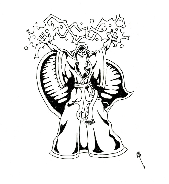
Dingbats!

"Project Dingbats"

This project began with a serious brainstorm the ended with me settling on the theme of "Wizards". This seemed like a theme a could easily work with, and perhaps not have to delve too deeply into the research department to my already fairly good visual familiarity with the subject.
I began just drawing from ideas that came to me, these first sketches were mostly cartoony almost resembling cheesy chip art one would find in MS: Word.

After about 10 images the classic "bearded man in the pointy hat" began to get a bit dry and I tried to branch out a bit. I began to think about different kinds of "wizards" wheather of not these wizards would be good or evil and maybe how they could dress differently then the pointy hat while still looking mystical.

At this point I began to do some more visual research online looking work by the lead artists for blizzard as well as numerous other images I just found searching google. However, the at this point I would also say my theme took a bit of a shift in that i decided to go from drawing just wizards to "people I know in real life who are most likely wizards". This gave me all sorts of new ideas for people to draw, including celebrities, teachers and the old men I see at work. Finally I ended by decided to mix it up a bit more and add some females to eh groups as well and drew a few sorceresses.

Once I had 30 images I went back to clean some of them up and by adding color and in a few cases going a bit overboard with the detail but overall getting some great images in the end. The finished products are categorized below.
The Line Wizards:

The Wizards of Color:

The Sorceresses of the Overly Indulgent Attention Span:

Scarlyn's Back!

That's right she's back and she wants YOOOUUUU!!! After having so much fun drawing wizards on flash last week and upon finding myself with more free time to chill in the lab then expected Monday afternoon I decided to create this image. Scarlyn, as some of you may remember, is my rogue from WoW. She was last seen being awesome right here on my blog, which is where she is right now being awesome as usual! She is possibly the best damn rogue in the whole World of Warcraft and sips expensive wine all the time.


Block Town: 3D modelling take 1

The initial start for this work was in looking that the drawings by Piranesi and the being overwhelmed by the overall epic of it all. I decided it wanted to try to model some of this epic structures and gathered about 10 or 12 works of his.

I settled on what I wanted to do and had at it, choosing an image of what I would guess to be a temple surrounded by smaller buildings. I decided this image offered the right balance of difficulty (since it was not covered on every surface by tiny statues) and what I would call the epic factor.

I recreated the structure as best I could to match the original shot angle. I had planned on modeling some of the other structures after this but decided to continue working with this one. Although I was able to match the original sketch in terms of shape and scale I feared some of the epic feeling was lost in the translation from line shaded drawing to blank gray forms. I decided to try to regain some of the epic feel by playing with the angles of the shot instead.


Visual Research:
The works of Giovanni Battista Piranesi, and his study antique architecture.